Google Photos to Replace Library with Collections on Android
- Androbranch NEWS
- Aug 11, 2024
- 3 min read
Google library in Google Photos for android two years ago redesigned its Library area, and walked back the redesign. Today, Google Photos reveals a massive redesign that sees the "Library" tab replaced by something new called "Collections." This is intended to let users get where they're going faster by simplifying the manner in which content is organized and accessed within the app.

A Second Attempt at Revamping the Library
Two years ago, Google tried to revamp the Library section in their Google Photos app. Despite the attempt to refresh, most of those changes were reverted due to a backlash. Now, Google is trying again with a "Collections" inside of the new experience. Only a couple of days after it was officially revealed, this update is intended to make the most-used functions faster and easier to get at whilst providing a well-organized headpiece.
What’s New in Collections?
The Collections tab will retain the same logo as the old Library tab but comes with several notable improvements. Here's a breakdown of the key changes:
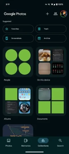
Quick Access to Favorites and Trash: These folders are now more accessible, allowing users to find their favorite photos and recover deleted items with ease.
2×2 Grid Layout: The rest of the sections are arranged in a 2×2 grid layout, tailored to your usage patterns. This layout is designed to make navigation more intuitive and faster.
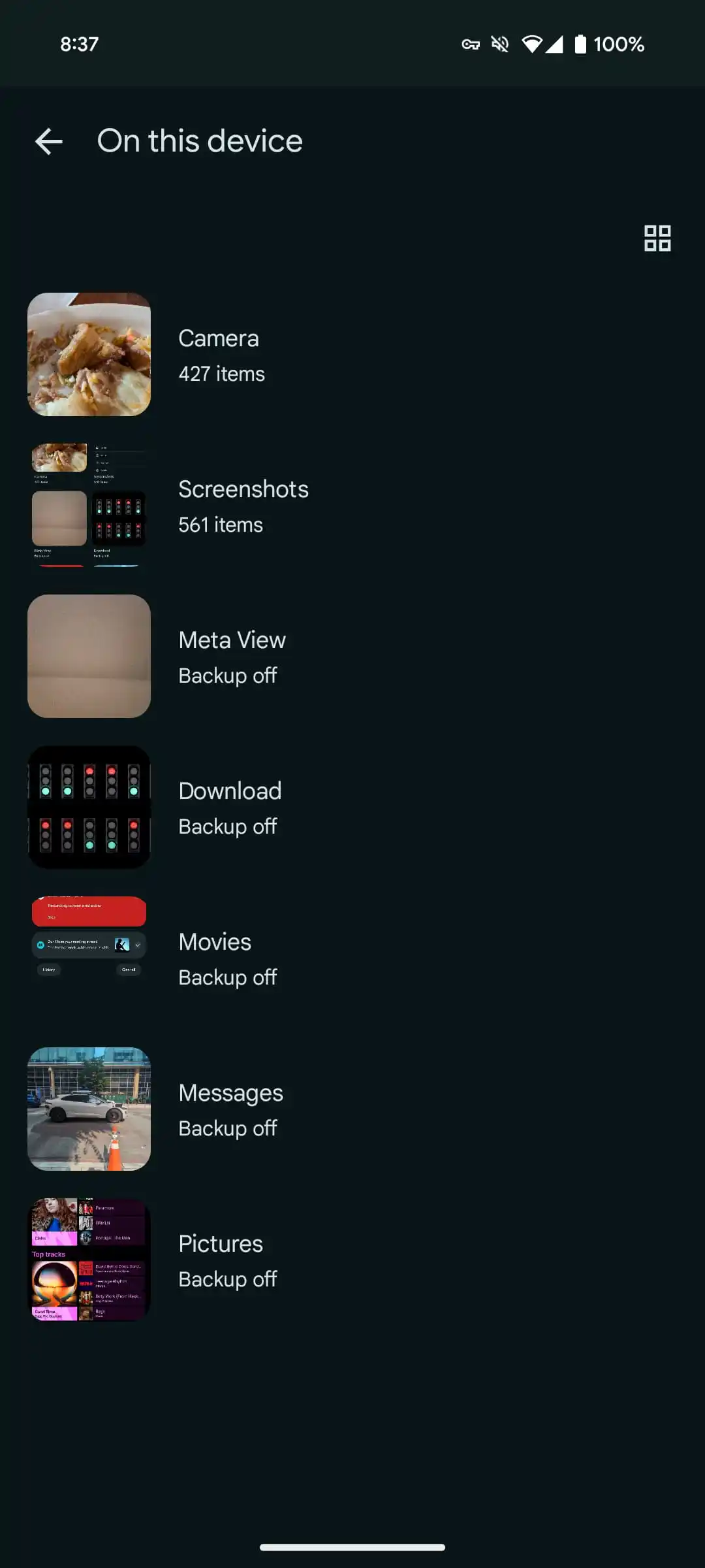
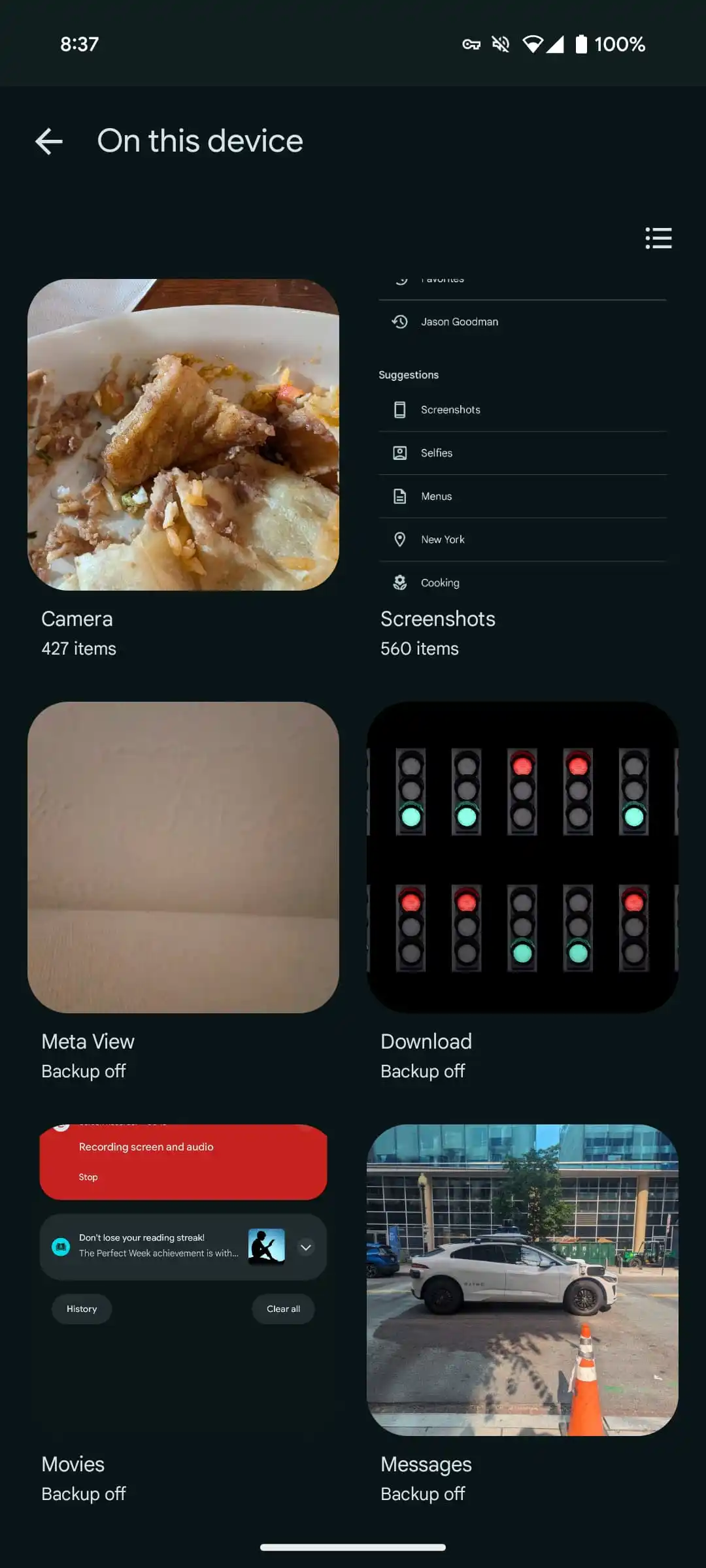
'On This Device' Folder: The existing ‘Photos On Device' folder will be replaced with ‘On This Device,’ showing images and videos saved locally on your smartphone or tablet in a grid format. However, this might require an extra tap to access, which could be a slight inconvenience for some users.
New Sections and Missing Utilities
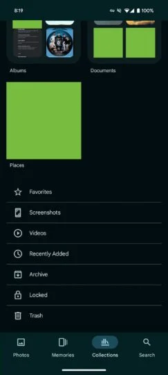
In addition to the layout changes, several new sections have been added, including Albums, Archive, Documents, Locked, People, Recently Added, Screenshots, and Videos. Notably, the app no longer features a dedicated Utilities folder. Instead, the tools previously found in Utilities are now spread across various sections:
Locked Folder: Accessible by tapping Collections and then Locked at the bottom.
Import Photos: Found under “Create +” at the top, with an option to import from other places.
New Creations: The Create + button also lets you make new albums, collages, highlight videos, cinematic photos, or animations.
Free Up Space: This option is now under your Account profile photo or Initial, helping you manage storage on your device.
Move Photos to Archive: You can now archive photos by selecting a photo, tapping More, and choosing Move to archive.
Manage Photo Frames: This feature is located under your Account profile photo or Initial, within the Photos settings, and then Apps & devices.
Redesigned Search Tab
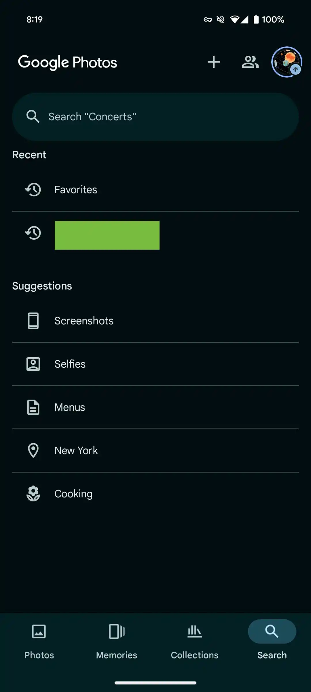
Another redesigned aspect of the website aside from the Collections update is featured in this Search tab. In the new design, you see a plain list containing recent searches and recommendations as Screenshots, Selfies or Menus. It's possible this coming change is to ready the app for the impending Gemini-fuelled Ask Photos feature, that aims at improving search in-app.
Google has made known that the new feature called Collections will be available to most Android and iOS users in a few days. If you haven't gotten the updated version yet, try checking your device for the latest software version to make sure you have all the features.
The new Collections and Search redesign is expected to be part of Google Photos version 6.93, so keep an eye out for the update on your device. This redesign marks a significant shift in how users will interact with their photos and videos, making the app more organized and user-friendly than ever before.
Comments